Saturday, January 19, 2008

Practical Measures

We've evolved our modules to a couple of variations. The smaller cylindrical variation allows more directional flexibility. Both modules' diameters are based on our available joint modelling material (38mm ping-pong balls). The narrower module, left is based on the diameter necessary to fit six cylinders onto a ping-pong ball, allowing regular branching in all three axes, or any obtuse angle from the joint.
We'll use acrylic tubing for manufacturing these, although in our imaginations they could be formed of sheet stock in situ. I expect our initial model to resemble a habitrail.
The broader module, shown flattened on the right, shares the 38mm diameter of the joint. These will allow us to create relatively gap-free "finish" surfaces. We've sized them so, lengthwise, they will be compatible.
Above is a layout sample for manufacture. It would be relatively easy to customize these modules for specific angles by moving the relative positions of the joint nests (ie holes).

Friday, January 18, 2008

1 module used for extesion: ability to connect with each other to increase length


connection questions: 1) dealing with small gaps. How do we seal?

2) Can we just assume engineering will take care of it?

our module continued


Scale


Creating "fabrics" with our module (or more like planes.)


This would allow us to grow in all different directions.


x,y,z structure


Thursday, January 17, 2008

The Flat Module


The fill module will probably be punched from flat stock. The dashed line represents the lap line for rolling and securing. The teeth on the end will help units lock together.

Wednesday, January 16, 2008

Module model


Module A "Joint"


Module B "Fill"

Monday, January 14, 2008


The Module, Part 2


Yeah, yeah. Blah, blah, blah. What does this mean?

It means: Simplify.


If you want a lot of stuff to work together, you need a lowest common denometer. You want the most options for angular branching so your forms aren't limited to right angles? Look to your (or your geeky friend's) dice bag:


The more surfaces, the more options, until you get a sphere.


So, a sphere is a very robust, simple form. What about the JOINT? Sure, the sphere could be the joint, if you poke holes into it, and your fill coule be sticks or planes with sticks sticking out of them and you're back to Tinkertoys. Or...


What if the joint is an inherent aspect of the fill?


Congratulations. We've just reinvented the burdock.


Neat things, unless you're trying to get them off the flanks of a squirmy, wooly dog. They inspired the invention of Velcro . So, what if you made burdocks with teeny, tiny hooks? Hooks so small, they wouldn't catch on fabric? What if you made those hooks smart, so they'd release on command?


Congratulations, we just thought up spider feet.

Spider feet are "smart" velcro. When the spider wants to move, unconscious controls make these little micrometer-scale hairs release. It all has to do with Van der Waals forces, which I am in no way qualified to explain.
So! Spider feet, spheres, burdocks- where's this going?
What if the "robot" came down to a matrix of smart velcro? Smart velcro that essentially broke down to "yes" and "no" binary commands? Movement would be progressive and cooperative between two surfaces, a ripple of "yes" commands, meaning grab and hold, propelling the skin (and the form within) forward across another skin/form, while in its wake leaving a trail of "No", meaning release, commands? The possibilites are infinite.
If this was on an electronic scale, could this smart velcro also devote a percntage of its binary transmission to transmitting data? So a structure is also a computer with human interface?
Someone probably already came up with this idea. GMTA?

The Module

Our next step is to come up with a module. The idea is: if you have a limited number of "primitives" with a set of rules governing how they interact, you have boundaries to work within. Examples include music, where in the Western scale we recombine twelve tones with a time matrix. And language, where a set number of sounds are recombined to create words, which are further modified by grammar.

Dafne and I talked about the nature of building. In the videos on robotic, self-building structures, we noticed that there were two aspects to pay attention to. These aspects are the JOINT and the FILL. Essentially, Tinkertoys (a Playskool product).

Your FILL can be as dumb as you like. It can be a stick, or a plane - something structural. The Fill and Joint work together to make a system.

We saw some robotics which were, essentially, a very fancy set of joints and fills. These robots could find each other, lock together to make form, move across each other cooperatively. The fills, in turn, could be compartments for other mechanisms or walls. It was pretty keen. The downside of these smart joints is how much effort goes into making them smart. How much coding does it take to get them to find each other, navigate, climb and assemble into shapes?

Here is where I plug architect and smarty-pants, A Scott Howe. Check out his website: http://bureau.west.cmu.edu/~ash/

We started bouncing ideas off of each other. What would be robust, expandable systems which would be transported efficiently AND/OR easily fabricated AND/OR self-replicating?

The problem with the moon is getting stuff there. But once there, solar energy is abundant. There is no life, so environmental concerns are minimal (within reason- we probably want to preserve a water table, if there is one).

Also keep in mind that gravity is 1/6th that of earth. Structures won't need to resist as much force, so building elements can be much smaller than our typical trabeated construction. This opens the door for tensile structures - why use a girder when a cable will do?

This also means that joints, typically being weak points in construction, will be less of a concern. I mean, on earth, a structure made of joints would be pretty weak. But if we use the same materials with 1/6th the load to support, that weakness is less of an issue.

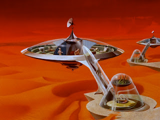
Urs' Images Part Deux

Unknown Artist
CA early 1960s
There's a lot to love about the heroic naivete of SciFi Pulp. WWII was over, humans had harnessed the power of the atom, Americans were full of smug assurance that we were the "Good Guys" and the universe would open to us, complete with all the comforts of home plus new delights to be discovered. Sure, there might be rough patches here and there, but only enough to make things interesting, opportunities to prove virility.
Here we have ideal suburban living, complete with a garage, covered entry, satellite TV and hot servile female.
Moon Base
1970's BBC series, UFO

A classic from the era of Space 1999 and Buck Rogers. The Apollo mission was still fresh in peoples' minds, and they had images with eerie lighting and space-grit-covered once-white ships, battered from the intense heat of re-entry to take the gloss off of the technocolor dreams of 1950s pulp. This modular set design feels more real to me than the CGI perfection of popular images such as the Halo game series.


Cover Art, Season 3 Lost in Space DVD
Space Travel in the throes of the Sexual Revolution, or Women Can Wear Short Skirts While They Make The Goddamn Coffee. See also: Star Trek, the original series.


Suburbs 2100

Dawid Michalczyk

http://www.art.eonworks.com/gallery/sci-fi/sci-fi_city-199805.html


This is interesting, and kind of quaint in the same way that Lost In Space is quaint. Sure, it's futuristic and all, but if we can make flying cars, why would we clutter our skylines with wires and flying petrol stations? I think it conveys the dystopian bleakness of what we expect to come from commercial enterprise. As in, extraterrestrial colonization is most likely to happen when there's financial incentive to make it happen. Like European expansion into the Americas, resources and commerce was the driving force. People pioneered in order to grab land and opportunities before others did.

The downside of this type of pioneering is, the work and railroad towns that sprung up as a result of enterprise weren't artful or lovely. They were functional and dangerous. Everyone was there to make a buck. I think this image conveys that fear pretty well.


Images from Urs

Assignment 1A was to find some images of space colonization. Let's begin.


Moon Colony
I found this image here: http://powerforce.moo.jp/page184.html

Unfortunately, my Japanese isn't good enough to make out more than some of the titles in Katakana (my kanji is lacking). I wish I could tell you the artist's name. I like the distortion created by the dome. A very recent, cold rendition.


As David Bowie sang about sailors fighting on the dance floor, he asked, is there life on Mars?

Mars Colony

Source: http://www.marssociety.org/


Ah. Space colonization as the equivalent to trailers scattered across the Mojave Desert! I CAN FEEL THE SIREN SONG! BOOK NOW FOR YOUR RED DIRT FARM VACATION! YOU, TOO, CAN LIVE IN AN INFLATED CLEAR PLASTIC NURSING SOW!

I would attribute this image to the late 1980s by the cut of the space suit. It's a very practical view: survival reliant upon self-sufficient pods. My question is, why would people travel all that way just to survive?


Cover, NSS 2008 Space Settlement Calendar (sold out)
Although the focus of this work is on a "halo"-style environment, I really liked the human touches which I feel a colony will need to survive. People like changes of scenery, we like things to be scaled appropriately for our viewing pace. A colony of 10,000 people won't have Chicago or LA-scaled buildings and avenues. Transportation will be a defining aspect. Will a small colony rely upon solar scooters of some sort? Can a small colony afford the expenditure of materials and resources for individual transportation, or rely on efficient mass transit?
These questions will, ultimately, define livable spaces. If everything is too overscaled and institutional, people won't feel comfortable there.